Release: 2013
Redesign Public Transport Bremen
Adrian Block and me were invited to attend the mentioned competition to create a new website for the public transport provider for Bremen, the BSAG (Bremen Tramways Corporation), in which we finished second. We developed the redesign for the BSAG in shape of a full web-prototype as well as in shape of a printed book documentation.

Concept
Our task was to design a new website for the BSAG that represents the new and modern BSAG in a fresh guise. In this, the user is presented the particular values of the BSAG, such as quality, service, safety, sustainability, environmental friendliness, and punctuality. The new website is designed to focus on the topic »humanity« – especially for those living and working in Bremen, the customers, of course, and the employees of the BSAG.


The website’s main concept is to promote the user’s intuitive behaviour through emotionally appealing design and a logically comprehensive display of information. The achieved reduction in complexity allows for a largely self-explanatory user interface through context-sensitive display of information and an interaction concept based on anticipated user expectations. The symbols we used were derived from everyday life, in the network plan as well as in station timetables, and on the BSAG’s vehicles in order to provide for trust and easy recognition. The new website is casual and airy, appeals to the user’s emotions and conveys motion and mobility.


Structure & grid
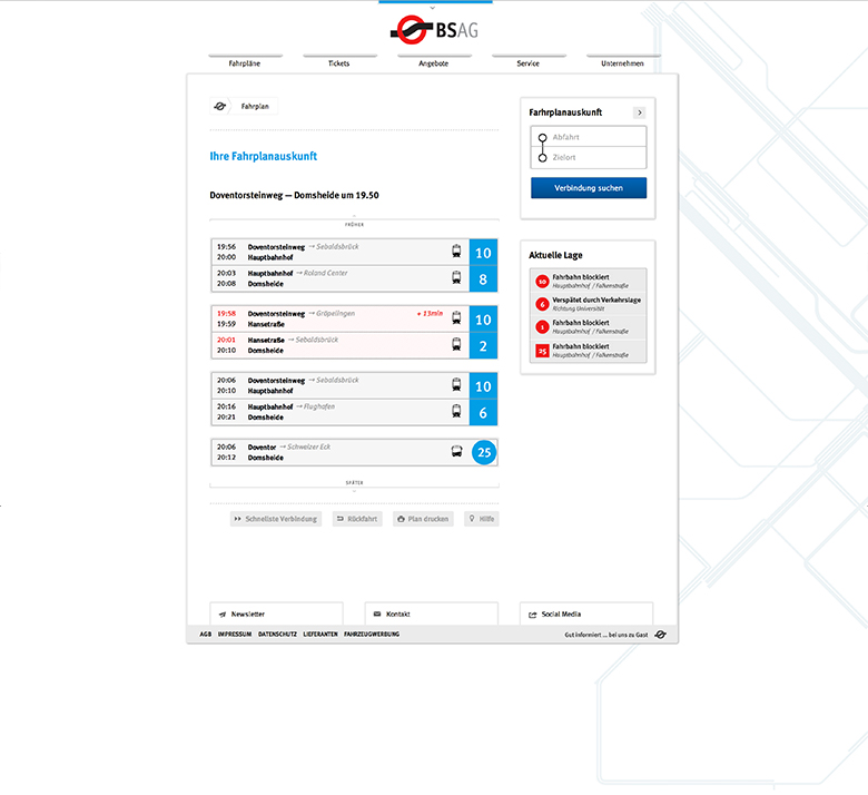
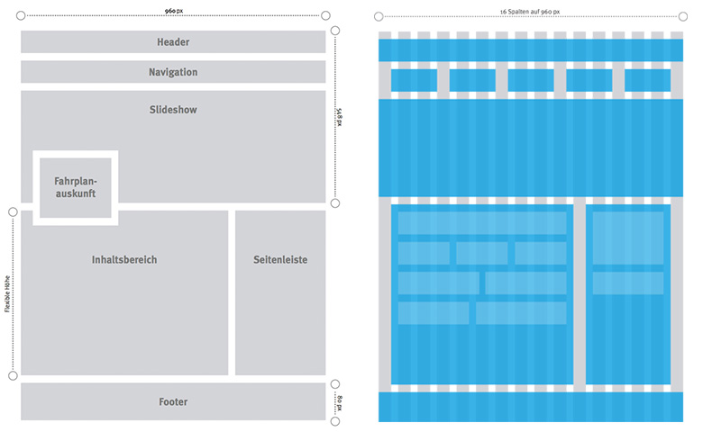
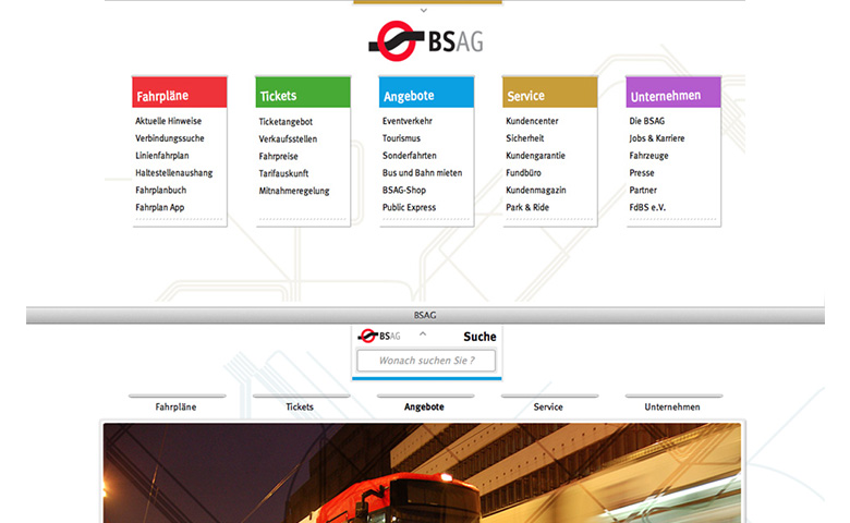
The new layout is divided into a header with navigation options, a slideshow, a content area with a sidebar, and footer. The journey planner is the main module of the website, as it appears omnipresent and always in the same place. The page is displayed 960 pixels wide and centred in the browser. The layout grid is divided into 16 columns, which can be flexibly combined and thereby divide the site uniformly.
Information architecture
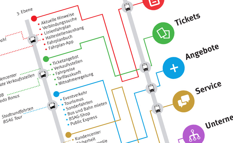
Navigating through the site is based on the experience of a train ride: First, the purchase of the ticket, followed by the train ride, and finally the reaching of the destination. Therefore, the information architecture has been restructured to five fictitious railway lines, representing each of the main contents of the BSAG website: Schedules, tickets, deals, service, and the company itself.
The main menu is divided uniformly into two more navigation levels. Due to the low plane depth, information architecture has been tightened and the total number of clicks for the respective target is reduced as a result. Catchy, brief, consistent, and unambiguous terms provide for the best possible readability and an easy navigation through the pages, supported by a self-explanatory menu.
Background image concept
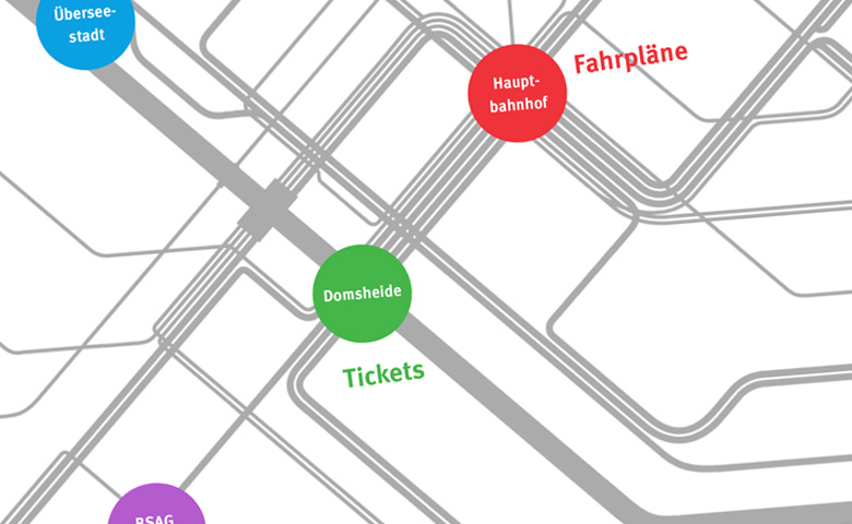
A simplified BSAG transit map is located in the background of the site and laid over the images of the slideshow. This links important locations of the BSAG network with the main menu items: The central station is representative of the main menu item »schedules« and the hub Domsheide representative of the main menu item »tickets«. Furthermore, the item »deals« is connected with the Überseestadt district, the item »service« to the Vegesack station, and the item »company« to the BSAG-Zentrum stop. The transit map in the background is moving depending on the selected menu item, so the associated site is located centered at the height of the slideshow and changes its colour to the respective colour of the menu item. At night, the transit map changes to the night transit map. The schedule in the background of the website provides for depth and creates the feeling of motion and mobility. In connection with the ticket slot-like menu design it also symbolises a ride with the BSAG.
Colour code and corporate design
The five main themes have been colour-coded for clearer distinction and better orientation and give the new website a certain freshness and variety in their colour scheme. The BSAG’s hitherto solely used red maintains, now standing among four other colours and symbolises the brand’s tradition and safety. The other colours blue, green, purple and bronze are representative of other values the BSAG embodies: Blue represents energy and motion, green stands for nature and environmental awareness, purple for passion and emotion, whereas bronze represents success and perfection.
Navigation & search
The navigation concept, as well as the information architecture and the background image concept, is based on the experience of a train ride. Stylised ticket slots automatically »print out tickets« on contact with the mouse as the user selects the respective sub-menu items. The third level of navigation is at the top of the sidebar content frame. The breadcrumb navigation in the content pane also shows the navigation path and allows a jump back to all sites of the respective navigation path.
The search function is discretely located above the centred BSAG logo on top of the site. Through the arrow situated besides, the search can be displayed or hidden, whereas the search will be automatically hidden if not used for a certain time. It is always accessible and serves as a central navigation element.
Icons & pictograms
New and modern icons and pictograms support a more efficient information display in a uniform visual language. Hereby, the recognition of the already known is promoted by symbolism in stylised imagery. The icons used here were taken from the icon set »Entypo«. Besides the generic icons, the vehicle icons have been redesigned for bus and train by hand. The modern and uniformly designed icons are modelled after real BSAG vehicles and can be recognised already by their stylised form. They speak the same language and design aesthetic as the original vehicles.

Responsive design
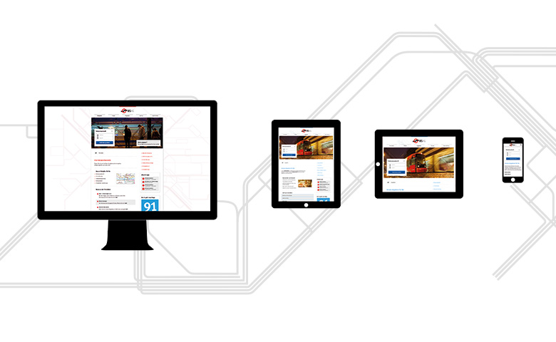
The website was created with a fluid layout for all modern devices, such as smartphones, tablets and desktop computers. To archive this, the layout of the browser window size is adjusted, respectively. To keep it simple: Different resolutions, screen formats and screen sizes are supported.
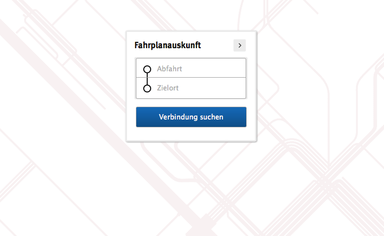
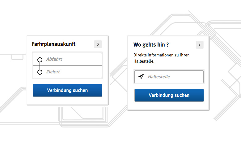
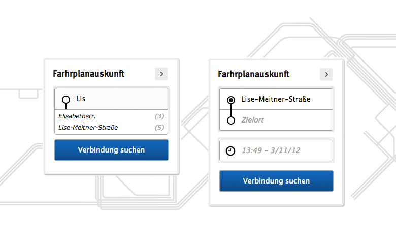
Journey planner modul
The journey planner is a central module of the website. Therefore, it is always present on each site. For faster data entry and easy, intuitive operation, the journey planner has been greatly simplified. The innovative operating concept includes the reduction of command prompts by context awareness: When entering a destination, for example, auto-complete suggestions and displays for time and date will only appear when they are needed. Irrelevant data entries are hidden. Furthermore, a schedule to provide information on stops has been integrated in this module and can be activated by the shift button. By entering the user’s position or, alternatively, through the auto-locating function of the browser, the timetable of the nearest bus stop will be displayed.
The result list has also been redesigned and now provides a clearer summary of the results of the search query by dividing it into separate groups, if needed, by simple yet clear display of delays, use of modern icons, optimized print options, and the new »fastest route« function.